LinkedIn Redesign
Date
July 2023
Role
UXUI Designer
Languages & Tools
Figma | Canva
Introduction
LinkedIn has made significant strides in enhancing its user interface elements and functionalities over time, which has contributed to its growing popularity. Nonetheless, there are still areas where the platform can further improve. The purpose is to identify three UI element issues and propose appropriate solutions. By addressing these issues, we aim to enhance the user experience on the LinkedIn platform and ensure a seamless and intuitive interface.
Issues & Solutions
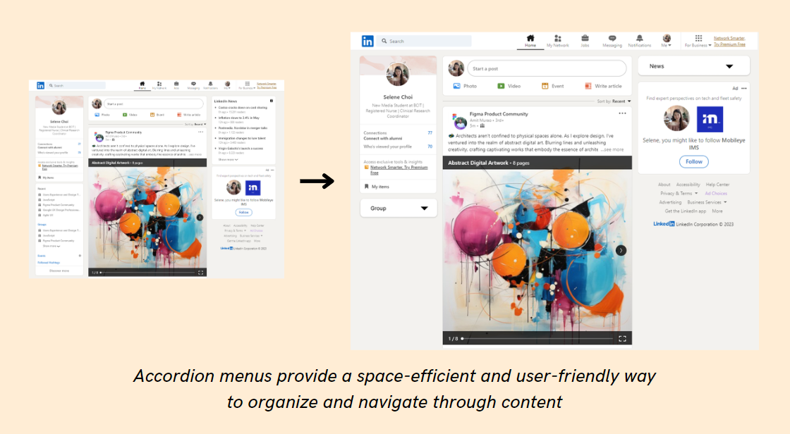
ISSUE:
Each category box occupies space, whether or not the user intends to keep
it visible. This can become inconvenient as it requires keeping all the elements on
a single page without any specific purpose.
SOLUTION:
By utilizing an accordion menu, users are empowered to effortlessly close or
open sections based on their preferences and specific needs. Even when a section
is closed, the category remains visually distinct, appearing bolded compared to
theoriginal, ensuring users can easily navigate and access relevant
information without any inconvenience.
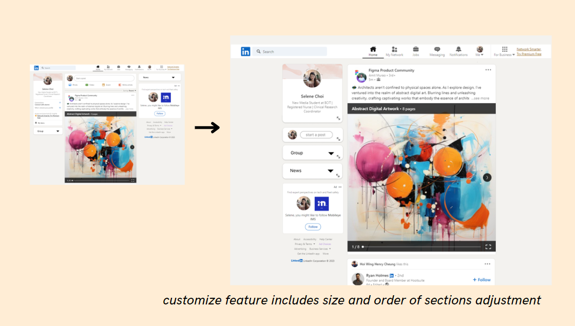
ISSUE:
Although efforts have been made to create efficient space and enhance
navigation for users, the layout still lacks organization. Users can easily become
confused by the multitude of functionalities on the website, as it lacks a clear
hierarchy and fails to consider the user's goals, despite having numerous sections
to
navigate.
SOLUTION:
By allowing users to customize their layout, including the size and order of
sections, we can effectively address this issue. While implementing this
functionality may require additional development work, it is a valuable feature to
have. This concept is inspired by widget settings on tablets or mobile devices. To
facilitate the customization process, elements indicating the ability to customize
the size and position of each box can be included, along with an edit button to
enable further customization options.
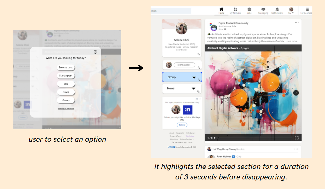
ISSUE:
LinkedIn provides numerous features for users to explore. However, sometimes it can
be frustrating for users to find what they are looking for on the homepage, as there
are multiple elements present. Unless one is a seasoned user of the platform, it can
be time-consuming and unclear for users to identify the specific section they need
to
click on.
SOLUTION:
To enhance user experience, consider implementing a popup box when users first land
on the page. This popup box will allow them to choose the specific category they are
interested in. Upon selecting an option, they will be directed to the landing page
with the corresponding section highlighted for 3 seconds.
Conclusion
In summary, this project assesses and proposes solutions for three UI issues on LinkedIn. Despite the platform's overall improvement, targeted enhancements are suggested to streamline the user experience. Features like accordion menus, customizable layouts, and category selection popups are introduced for a more organized, efficient, and user-friendly platform. Mockup pages illustrate these solutions, reinforcing our commitment to a professional and engaging LinkedIn experience.